In this post
All about frequency diagrams
A frequency diagram (also known as a bar chart) uses bars to represent each different part of a full data set. A similar table of data to that used with pie charts is used with a frequency diagram except the height of the bar is what represents the frequency. All the bars that are in a frequency diagram are of equal width (this means that each group should be of equal size) and there should be no gaps between any of the bars. The key thing to remember with frequency diagrams is that the groups are given in number forms. This makes this sort of diagram a good choice when looking into numerical groups such as age or amounts of something happening.
Example
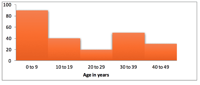
The table shown below is for data collected for the ages of different visitors to a theme park. Make a frequency diagram to represent this data.
| Age range (years) | Number of visitors |
|---|---|
| 0 – 9 | 90 |
| 10 – 19 | 40 |
| 20 – 29 | 20 |
| 30 – 39 | 50 |
| 40 – 49 | 30 |
This data tells us that the total number of visitors is 230 and using each different age range as one bar we can draw out the frequency diagram as shown below.


