In this post
What is a Histogram?
A histogram is basically a type of bar graph that will immediately tell us the spread of the data. The spread of data is just a way of seeing the distribution of frequency between certain groups or classes. Each frequency will tell us the amount of individual statistics that are in that particular group and we can then have an idea of which is the most likely.

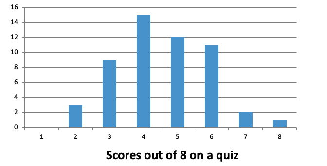
The histogram above shows the scores that different people got in a quiz of 8 questions. We can easily read off how many people got each different score from the chart (e.g. 11 people scored 6 marks). The number of people that achieved each score is the frequency. In the example case there were 11 people who scored 6 marks and so the frequency of scoring 6 was 11.
Most of the time the majority of scores will be around the most probable score that you would obtain. This then gives what looks like a curve with the least likely options having a lower frequency. Although, we have already seen that just because something is most likely to happen does not mean that it is a certainty, so this is only a rule of thumb and may not always be the case.


