In this post
All about line graphs
A line graph is a type of graph used mainly to show a difference of something over time. This is because a line runs all the way through the graph and can be followed and seen to ‘travel’ from start to finish as time goes by.
Example
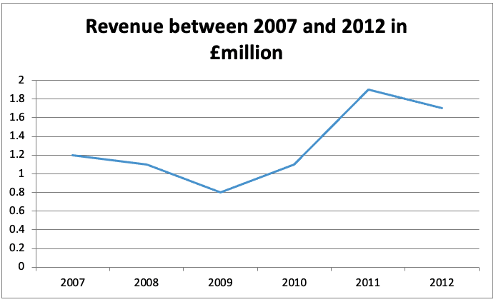
Below is a graph which shows a difference in revenue at a company from 2007 to 2012. Plot this data on a line graph.
| Year | Revenue (£m) |
|---|---|
| 2007 | 1.2 |
| 2008 | 1.1 |
| 2009 | 0.8 |
| 2010 | 1.1 |
| 2011 | 1.9 |
| 2012 | 1.7 |
To plot this data we must do the same method as with a frequency diagram but instead place a dot for each correct year at the right revenue amount. These dots are then joined up with straight lines.


